This week I decided to try a new layout thanks to enjoying another class member’s blog that used it, shoutout Coral for inspiring me to try something different. I felt like this week was more challenging because not nearly as many advertisements are done through print these days.
Norwegian – “The flag of flags”

This advertisement shows the Norwegian flag. On it are five rectangular boxes showing the flags of other countries that can be found in the Norwegian flag, along with the ticket prices of flights to those countries. In the bottom right corner is text that says “417 routes to 126 destinations. Discover the world with Norwegian”.
Product/Service: Norwegian Airlines
What was the appeal/objective of the ad: To show travelers some of the many places they could go and the prices if they flew with Norwegian Airlines.
Target Market: People wanting to travel
Action: To go discover the world with Norwegian Airlines
Value Proposition: To be able to travel at reasonable prices
IKEA – “Guilty Pets”

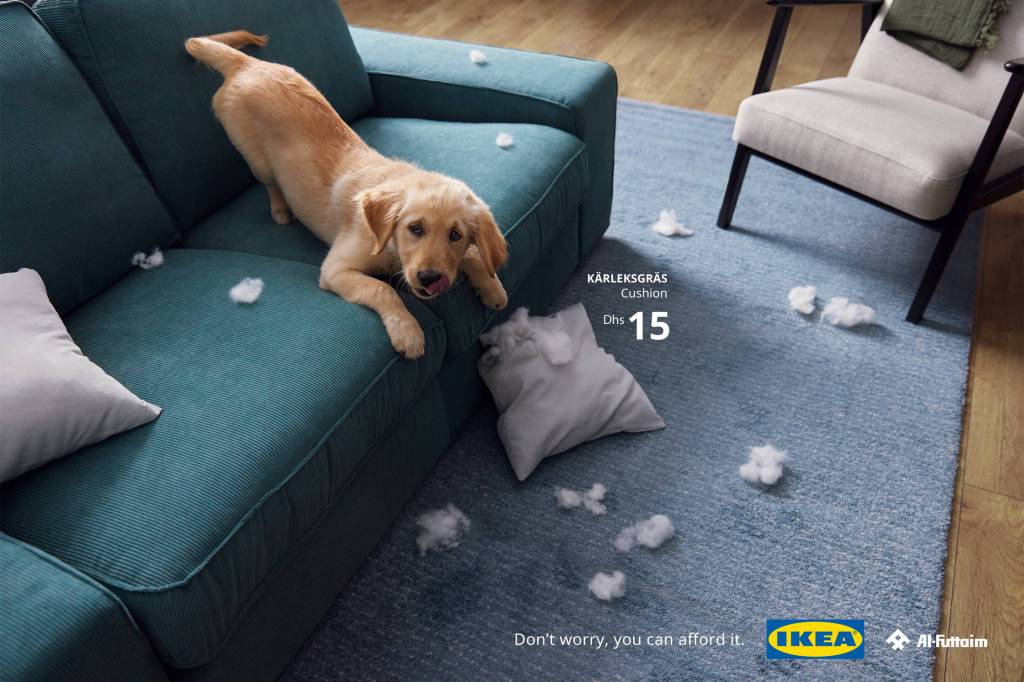
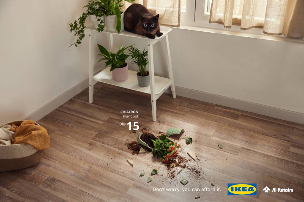

This ad campaign shows multiple different pets at different crime scenes of IKEA products “accidentally” broken by pets. Showing everyday situations that pet parents often experience at home (Ads of the World). The different ads show the price of the broken items, to reassure pet owners that replacing them is an affordable option.
Product/Service: IKEA home products
What was the appeal/objective of the ad: To let customers know not to panic when their pet breaks a mug or potted plant, at IKEA the prices are affordable. So, there’s no need to worry about replacing the broken item.
Target Market: Pet owners
Action: To buy IKEA products
Value Proposition: Consumers know that if one of their IKEA products breaks, that it won’t cost an arm and a leg or put them in a financial crisis to replace it.
Lavinya – “Morning Bear”

This advertisement takes place in a wintery forest. We can see a brown bear walking away from a cup of Lavinya Coffee. The advertisement reads “Awakens even from Hibernation”. Get it, because bears hibernate in the winter?
Product/Service: Lavinya Coffee
What was the appeal/objective of the ad: To get viewers to drink Lavinya Coffee because their carefully selected beans can wake a bear from hibernation
Target Market: Coffee drinkers and people who want “to stay awake all day”
Action: To buy Lavinya Coffee
Value Proposition: Consumers know that drinking Lavinya Coffee will taste good and keep them awake.
Hacer País – “But”
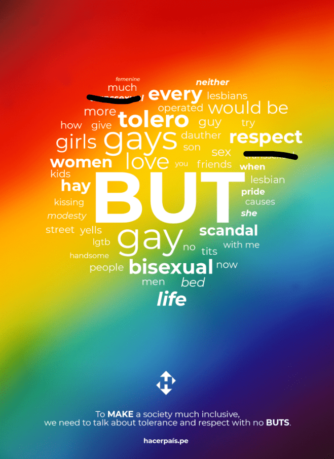
I do not agree with some of the language used in this advertisement and crossed out 2 of the words to be inclusive of all who read this blog post.
From what limited information I could find about this ad, this is an advertisement for the progressive political party Hacer País, which roughly translates to “Make Country”. Hacer País is an active party but is not registered. They are currently in the process of registering to participate in the 2026 election (Diario El Comercio).
This advertisement has a rainbow background with multiple words of various sizes making the shape of a heart. The words consist of “gay”, “respect”, “transexual”, “modesty”, “people”, and more. At the very center of the heart, in the biggest font, is the word “BUT”. Read at the bottom of the ad, “To MAKE a society much more inclusive, we need to talk about tolerance and respect with no BUTS.”
Product/Service: Hacer País
Objective: To let voters in Peru know that Hacer País stands for inclusivity of all, with no buts
Target Market: Voters in Peru
Value Proposition: This lets voters in Peru know that this political party is inclusive and respectful of all.
Devon King’s – “International Women’s Day: She Is…”

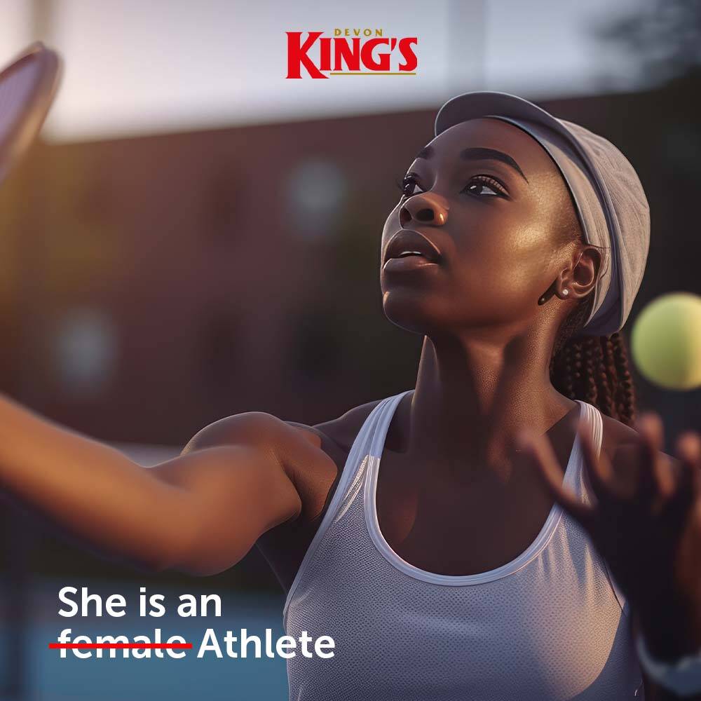


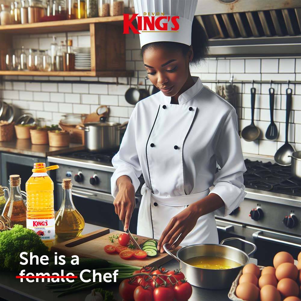
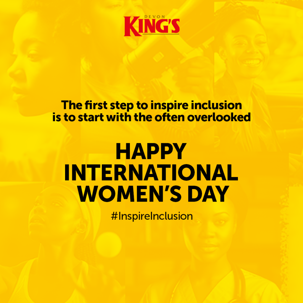
This advertisement campaign shows pictures of women in their jobs. On each ad there is text that reads “She is a female…” and her job title, with the word female crossed out. The last image of the campaign shows all the women in the other ad pieces and the text reads “The first step to inspire inclusion is to start with the often overlooked. Happy International Women’s Day #InspireInclusion”
Product/Service: Devon King’s
What was the appeal/objective of the ad: To erase the prefix ‘female’ that is added to various job descriptions to stop diminishing women who excel in their fields (Ads of the World).
Target Market: Everyone
Action: To erase the stereotype of women not being capable of the same accomplishments as men, that insert accomplishment here is an equal accomplishment for both men and women.
Additional References:
Khenkin S. Spanish Political Party System at the Crossroads. World Eсonomy and International Relations, 2017, vol. 61, no. 4, pp. 71-80. https://doi.org/10.20542/0131-2227-2017-61-4-71-80
PERÚ, Diario El Comercio (29 June 2020). “Reforma política: Nuevos partidos en manos del Congreso”.

Hi Meaghan!
You did a really good job on your print analysis. I thought the Norweigan Flag was an effective way to try to get people to travel to all of its countries. It also did a great job of bringing awareness to travel prices if you are interested in going. I also like the International Women’s Day ad because I am a woman and sometimes you just want to be told you’re great without being categorized. For example, “You throw great, for a woman.” Hacer Pais met their objective to be more inclusive in its ad, but it just felt all over the place. I think my two favorite ads were the IKEA pet ad because I can relate as a pet owner. Also, their items are affordable for the most part, so they don’t want you to sweat any broken objects or get upset with your pets; just buy a new one. I also enjoyed the humor in the Lavinya ad. The coffee will not only wake you up but the hibernating bear that’s on its way…..oh no! I thought this one was a really good advertisement. Again, kudos to you on another great analysis!
LikeLiked by 1 person
Thank you for commenting Tonya!
I agree with you that the Hacer País ad felt a bit all over the place, I liked what they were trying to accomplish but it could have been done in a more organized way. If they would have narrowed the focus to just LGBTQ+ members and allies, I feel like it would’ve felt less all over the place. I also think I am a little biased towards this ad because it took me so long to find any information on this ad or what Hacer País is.
LikeLike
Meaghan,
I appreciate your choice of layout for your analysis; it was an easy read and you chose some great print ads to feature. I especially appreciate your analysis of IKEA’s Guilty Pets campaign. My spouse and I have two cats and two, young, energetic and reactive Australian Shepherds! We have learned from experience that we should not invest in expensive furniture until they are all a bit older. They’re practically toddlers! IKEA definitely hit the mark with their target audience.
The ad that stood out to me the most was the “But” print ad for Hacer País. I agree with Tonya that the ad itself felt disorganized. However, I don’t believe that the political party met their objective to promote themselves as more inclusive. Words like “scandal, tits, street, yell, causes, modesty, and transexual” are used in the ad which can be misleading. Generally speaking, I understand what the ad is trying to accomplish; but these particular words have negative connotations associated with them. Likewise, the word transexual is outdated and offensive to some – the appropriate terminology would be transgender.
For anyone who wants to learn more about transgender identity terms visit this link. https://www.plannedparenthood.org/learn/gender-identity/transgender/transgender-identity-terms-and-labels
Your analysis touched on several important social and political topics. I applaud your willingness to feature these on your blog!
I look forward to reading more. Cheers!
Macie Cruz
LikeLiked by 1 person
I appreciate your comment Macie! Thank you for including a resource about the outdated terminology used in this ad, I’m honestly quite shocked this was advertisement was printed in 2022 and didn’t think to look up the terminology they were using.
I appreciate your perspective on the ad as well, I read it as how someone could say “he’s handsome, but gay”, “I like guys, but I may be bisexual”, etc. Looking at it with both perspectives, Hacer Pais did not accomplish their goal. I agree with you that using non-inclusive and up to date terminology does not show that they respect everyone. I wish I could find where or why the marketing department chose the words that are included in the advertisement.
Thank you again for educating me about the outdated language used.
LikeLike
Meaghan,
To clarify, my intention was not to suggest that you used outdated terminology. You didn’t know and that’s okay! I included the resource for anyone interested in learning more, but I do appreciate your acknowledgment of its misuse within the ad. I agree that it would be interesting to know why they chose those particular words and format/layout. If executed better, this could have been a great ad.
Thank you for the reply back!
Macie
LikeLiked by 1 person
Hi Meaghan,
First and foremost, thank you for the shout-out, I hope this layout worked well for you. It was definitely a pleasure to read your analysis and easy for me to extract your key points. I think this layout resonates for me because it mimics a creative brief and outlines the consistent elements of a productive ad. You did a great job with this assignment!
I love the choice of ads and would like to speak to the ads on inclusion and female empowerment. They both evoked such emotion for me and were so well done. To that, I would like to commend you on taking the highest ground and being sensitive to others and not offending. I think it shows true compassion and empathy that you took the time to black out what you felt was inappropriate. A true sign of an excellent leader!
Cheers,
Coral
LikeLiked by 1 person
You deserve all the credit for the layout, I wouldn’t have thought of it without reading your blog posts.
The layout has definitely helped me get better at pinpointing what information I need to look at and take from the ads for these assignments. I feel like as a reader it makes responding to ads a little less daunting of a task. I have been able to digest more of the information in this style, versus when I would put it all into paragraphs.
I was honestly nervous to post those advertisements because of their somewhat political/dividing nature. But at the end of the day, the ads I choose are what sticks out to me and are matters that are important to me. As embarrassed as I was when I found out that I put something out there with outdated/possibly offensive terminology, it didn’t feel right to delete the ad or replace it with something else. I thought of myself as someone who was knowledgeable on the subject and still didn’t know. I thought that maybe others could possibly learn from my mistake and hopefully help educate others.
Thank you so much for your kind comment Coral!
LikeLike
Meaghan,
No big response here, I just wanted to callout your choice of the IKEA Guilty Pets ad. What at awesome way to remind customers that IKEA is there with both affordable and easy to install furniture and fixture options. Let’s face it, anyone who has a pet (I have a goofy lab who breaks something weekly) will surely resonate with this message as we regularly find broken items or chewed up furniture around the house. Transparently, I have replaced several items over the past few years with IKEA options simply out of convenience. Thus, while you had some great selections, this one really landed with me and I wanted to comment. Thanks for sharing!
Cheers,
Zane Breeding
LikeLike
Thank you for sharing your experience in relation to this ad! I hope you get a week off on broken things soon.
I personally chose this advertisement because I also have a destructive puppy, and am having to replace furniture or home things on the regular. We have had many talks about not investing too much just in case it gets ruined again, hopefully it’s just a phase.
LikeLike
Great work!
All of these ads are different and most likely due to their varying country of origins. I wanted to comment on how you can to choose these ads. Each is focused on a variety of topics and showcases the difference in design even within the same medium. I will say I agree with Tonya on the Hacer Pais ad. This ad was all over the place and in my experience ads that are designed to be largely inclusive seem to me, and this is my opinion, to fall short of a target. These ads in desire and creation have a great meaning, but what I have seen in other areas of my work, the broader the topics the busier the ad. Personally, I love word chart ads such as this one, but if someone fails to read the bottom line the message may be missed. Also, the coffee ad was very hard to read, I found the focus was more on the bear, and with a largely white background the text was hard to distinguish. Some great ads, but it is clear that these designs did not originate in America as we focus a lot on the brand rather than environment.
LikeLike
I agree with your comments Ivan!
There is definitely a way to make an add “too much” or “overwhelming”. The word chart ads have to be done very carefully, to get the message across without distracting.
As much as I liked the appeal of the ad, I agree that it’s not easily read. Lavinya could’ve chose a different font/color combination or provided an alternative text option.
Thank you for your comments!
LikeLike
Meaghan,
I also felt that finding material and examples for print advertisements and marketing campaigns was more challenging that finding such instance for different mediums. Even so, you found some really great examples, with some features some very important messages. I love the analogy presented in the “Morning Bear” advertisement. Depicting that their product ‘can even wake a bear from hibernation’, what a great way to advertise coffee and truly get the audience to clearly understand what message the company is trying to make.
LikeLike
Thank you Madelynn
I thought the ‘waking a bear from hibernation’ saying was such a cute yet great way to show how effective their coffee is!
LikeLike